Tools
Figma, G-Suite, Canva
My Role
Product Designer +
User Researcher
Timeline
(1 year, 3 months)
Sept 2023 - Dec 2024
Team
1 Product Manager,
1 Technical Project Manager,
3 designers,
5 engineers
Standing out as a project team is a challenge when you're one of 34 others striving to make an impact.
Context
How might we create a a more engaging and interactive website experience that clearly explains the application process?
Cornell Digital Tech and Innovation has been a cross-functional engineering project team that creates digital products to improve student life since 2017. We receive 100+ applications to join, with 10,000+ visits to our website annually.
Problem Discovery
The big question is, “Why apply to DTI?”
DTI’s previous website and values weren’t reflective of the latest cohort of students, as it was last updated in 2017.
My task was to redesign the “apply” page, where students can learn about our application process.
I took it upon myself to create a design that was dynamic and informative by providing more accessibility to resources.
My personal goal was to increase diversity by upskilling any student interested in engineering.
Final Result Sneak Peek
Meet DTI’s latest application information page!
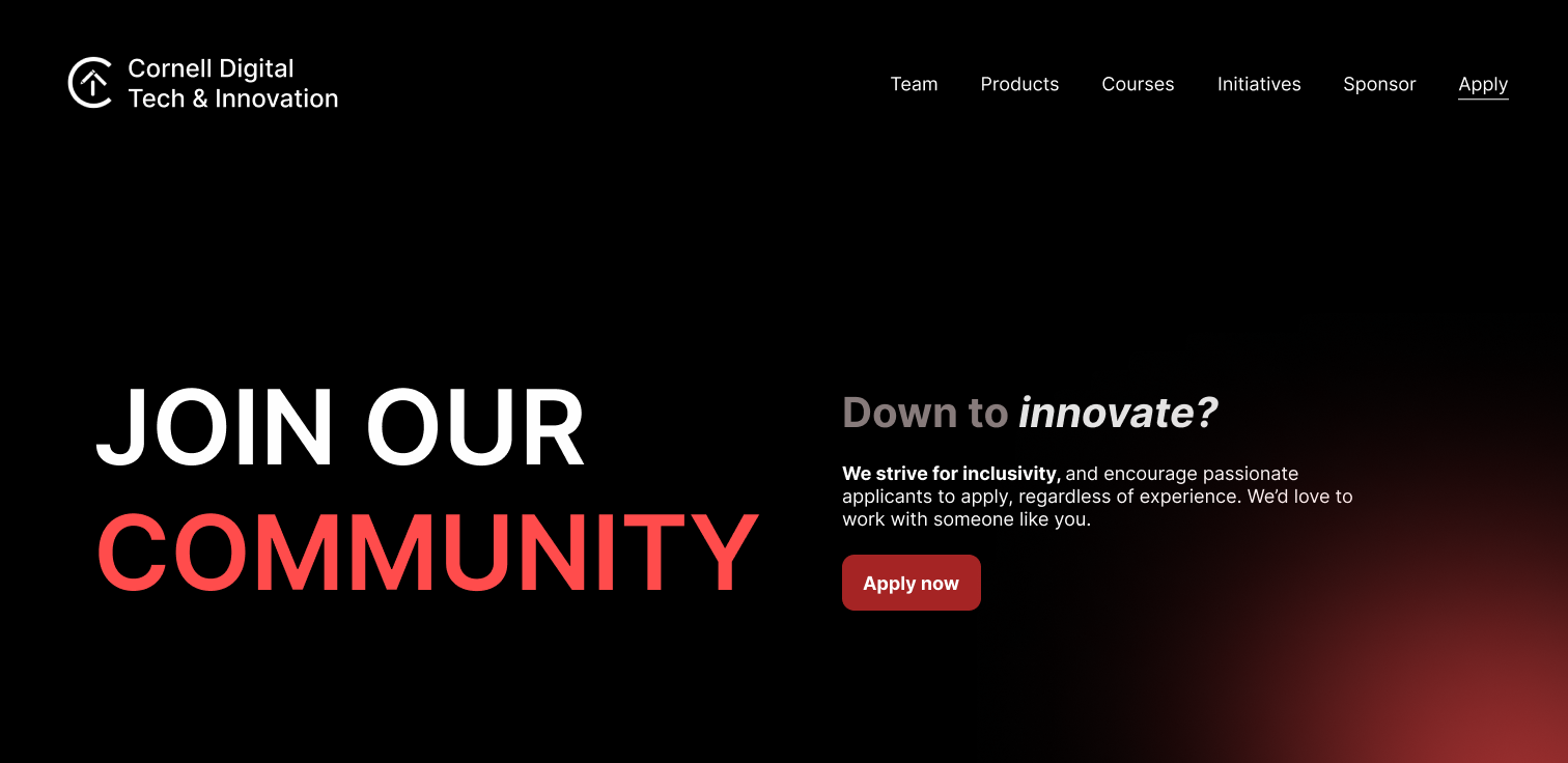
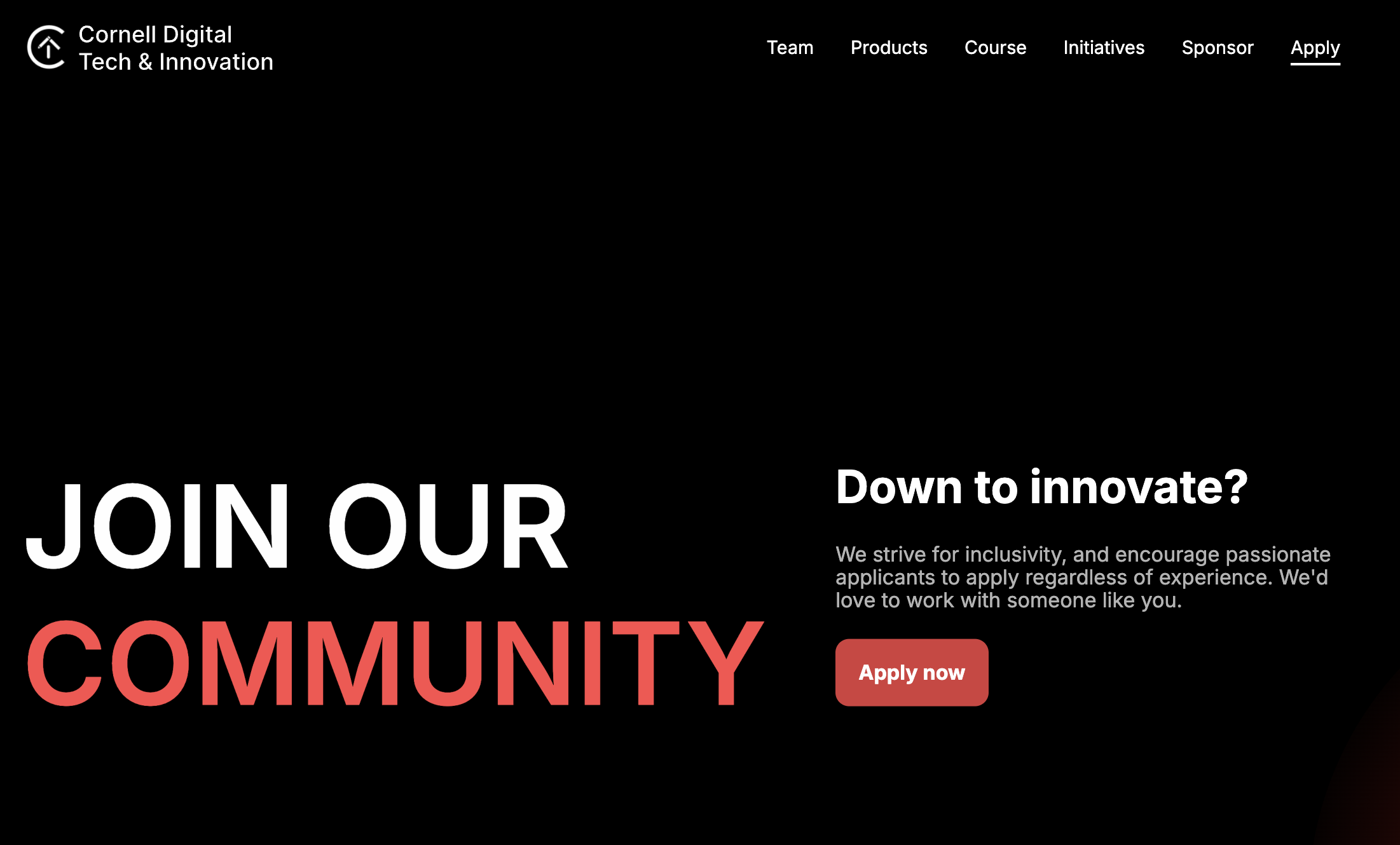
1.Header
Establish the tone, call to action, and
summary of the page quickly and in one screen.
2.Application Timeline
Visually communicate the application process so that all kinds of applicants understand the materials and interview date expectations.
3.Role Descriptions
Summarize the differing roles and responsibilities an applicant can expect to have before applying to a role, being able to sift through the different positions in order to have an efficient experience comparing opportunities.
4.FAQs
Let’s start from the beginning!
Provide detailed responses to common questions students ask about the application process. We aim to lower the barrier of entry for students with little engineering recruitment experience by providing a library of resources that an applicant can review and prepare with.
Mapping the Process
How should we tackle this problem?
UX Audit
User Interviews
Synthesis
Research
Find Brand Voice
Develop Content Requirements based on Research
Content
Brainstorm design variations for layout
Get feedback on product and re-iterate
Design
Who are the redesign stakeholders?
Branding for a whole team requires input from the whole team.
DTI’s student leads knew the brand inside out. I had to ensure that my designs were able to cater to the growing needs of the organization while also respecting the history and brand of its origin.
Cornell Engineering had specific guidelines about branding as DTI is an official engineering project team. I had to be careful to not push the bounds too much and to make sure I was operating within established design rules.
DTI members, who this website would be representing, also would have expectations on what the site should look like. I had to make sure I was representing the heart of the organization well, too.
Defining Usability Problems
First, I have to understand what I had to work with through a quick website audit.
Role Descriptions: Drop down menus have a lot of white space, not effectively using the real estate available on the screen.
Timeline: Is there a way we can visually communicate the differing application timelines for freshmen/upperclassmen?
FAQs: How can we use the blank space better, and provide more detailed responses to questions to help students with the application process?
Establishing the Brand
I had to ask myself, “What defines DTI? Where is evidence of their branding?”
Upon reviewing the common language of different pages from the previous website, I found that DTI’s voice is:
💪 Community-Centric
⭐ Collaborative & Inclusive
🖊️ Professional & Encouraging
🗣️ Inspirational & Purpose-Driven
✔️ all information is necessary and relevant
✔️ minimalistic interactivity, easy to skim
✔️ branding is clear due to word choice
✔️ strong identity evident in aesthetic
UX Audit Conclusions
Strengths
Areas of Improvement
✖️ quite text-heavy
✖️ no consistent layout
✖️ lacks details with some information
✖️ less user control for information gathering
Opportunities
🌱 brand growth through dynamicity and interactivity
🌱 explore layout possibilities
🌱 condense information
🌱 create helpful content to inform the user of DTI’s values and openings
User Research
After understanding the full context of the problem, I began to understand my users.
Phil is 19 and a first year hoping to major in information science. This is his first time recruiting, and his first time applying to DTI.
One of our most prominent users are students who want to join DTI and aren’t well versed in the recruitment process, or how networking works.
Stella, 20 is a 2nd year studying computer science. She’s applied to DTI once before, and hopes to try interviewing again.
Our other prominent user base are experienced students who are trying to apply to project teams a second time. They feel a little more prepared.
Talking with them helped me find some major pain points; they didn’t have the information they wanted, and current content was insufficient.
“I’m not really sure what coffee chatting does, and feel awkward doing it. Also, I’ve never applied for an organization before.”
One of my findings is that students new to college struggled with assimilating to a new environment, like professional relationships and processes.
“Though I’ve gone through the application process before, I don’t know how I can improve or how to prepare to do better this time.”
A consistent finding in the upperclassmen population was that re-applying felt like shooting in the dark - unsure how to better prepare.
Defining Product Goals
To ensure that I fully addressed these pain points, I prioritized my ambitions and intentions into actionable goals.
☕ incentivize and encourage coffee chatting by highlighting DTI’s community building initiatives.
🎨 refresh DTI’s brand with a new website interface that creates a dynamic, engaging and informative atmosphere to users.
🚀 enhance student support with copy that establishes comprehensive job functions to match industry-standard job opportunities.
🌈 increase diversity and promote equal opportunities to all potential applicants by providing new content that explains the process.
Students review the application timelines and FAQs the most.
Combined Timeline and FAQ Brainstorms: Flow Iterations
Ideating A Design Solution
As you can see in the original video, the timeline and FAQs were separated. To create a more condensed view, I thought it would be best that users are able to see when their application materials are due and any important information together, in the same view to prevent too much scrolling.
I was stubborn to keep the FAQ and timeline portion combined so that there was less scrolling, but that was less standard, and risked hidden information. So, I separated the two, deciding that they served purposes so different that scrolling was necessary.
Timeline section Final Design
FAQ section Final Design
✔️ allows for a clear visualization of the application process
✔️ vertical instead of horizontal which allows for the case in which there are multiple recruitment events
✔️ maintains live event updates for visual communication, bolding and enlarging the current recruitment event
✔️ provides essential information without hiding anything
✔️ design is flexible for fall and spring semesters when there are single vs multiple application timelines for different students
✔️ all information is necessary and relevant
✔️ minimalistic interactivity, easy to skim
✔️ content suffices if a user visits outside the application cycle
Combined Timeline and FAQ Brainstorms: Flow Iteration 2
Strengths
Areas of Improvement
✖️ quite text-heavy
✖️ no consistent layout
✖️ lacks details with some information
Opportunities
🌱 brand growth through dynamicity and interactivity
🌱 explore layout possibilities
🌱 condense information
✔️ progress bar allows users to have live recruitment updates
✔️ provides space for location, date, time and event title
Strengths
Areas of Improvement
✖️ the second modal box hides information
✖️ the question mark and coffee button are not intuitive nor standard
✖️ horizontal scrolling conflicts with the use case where there are multiple recruitment events
Opportunities
🌱 animation exploration allowed us to convey information with interactivity instead of words
🌱 sections in the FAQ that included recruitment help allows equal opportunity to underclassmen who are applying for the first time
✔️ saves real estate space by utilizing drop down menus than static information
✔️ chips allow users to control what kinds of information is open and visible at a time
✔️ unlike the original website, users can open multiple dropdowns at once for review rather than only one at a time
“It’s hard to learn about different roles on DTI and decide what I’m really interested in applying for.”
This is one of our biggest takeaways during our user research. With this in mind, I wanted to make sure that it was not only easy to digest the differing responsibilities per role, but also to compare them so that students can see which position would best suit their needs.
Role Descriptions Early Design
I realized that a lot of my designs are quite long and need a lot of scrolling, which taught me the importance of standard, concise design.
Role Descriptions Final Design
✔️ shows all the information without hiding it previously with a dropdown menu in the original
✖️ it takes too long to scroll, a little too much content
✖️ capitalization makes it difficult to read long titles
✖️ the inconsistent left and center aligned creates too much cognitive load for users to read properly
🌱 more detailed than before, able to understand full scope of responsibilities
✔️ shows all the information without hiding it previously with a dropdown menu in the original
✔️ skimmable and utilizes sentence capitalization, making it easier on the eyes and easier to read
✔️cuts information to the most key details, as well as still being detailed enough to describe the full scope of responsibilities
Early designs of sifting through specific open positions to learn more about them.
“I never knew what coffee chatting was before coming to Cornell.”
A large part of our user base - underclassmen - were unfamiliar with coffee chatting and its importance to the application cycle in both DTI and in the industry. It was important for me to help students learn what is was, and more importantly, how to do it to provide a learning opportunity for budding students.
Coffee Chats: Early Design
One of DTI’s unique characteristics is its emphasis on the importance of community to encourage a culture of coffee chatting people outside your team to learn more about others.
✔️ all information is necessary and relevant
✔️ minimalistic interactivity, easy to skim
✔️ clear CTA to encourage next steps
Strengths
Areas of Improvement
✖️ freshmen students might not understand what coffee chatting is, making the icon confusing
✖️ it doesn’t feel welcoming like we want these talks to be
Opportunities
🌱 potential to explore different approaches to coffee chatting that are less intimidating
🌱 get a chance to showcase our team members and their strengths
Coffee Chats: Early Designs II
Coffee Chats: Final Design
✔️ a brand new way to approach coffee chatting and randomizing students you meet
✔️ reduces subteam division by encouraging applicants to talk to all types of students with different filters
✖️ can be confusing to understand as it stretches beyond traditional design practices
✖️ may have difficulty randomizing different people as the team grows and evolves
✖️ in previous work, red was an action button, but here it acts as a filter which makes it hard to distinguish
✔️ a much more concise version of the above iterations
✔️ gets a chance to read a summary of the student before commiting to a chat
✔️ clear action button to reach out to this student, and other professional platforms to learn more about them
This design was one that we decided to not put on the application page, but rather the team page so that it would be more intuitive, accommodating natural user flows. We put a link to the team page and encouraged coffee chatting in the FAQ section instead.
With the application page’s main features designed for, how can we create a direct yet engaging landing page?
Landing Page Early Design
How can we attract users to scroll through our site, maintain flavor and providing favorable call to actions?
This design feels cleaner, has a bold title line that uses vocabulary that exudes our brand voice, with an arrow to let users know that there is more information if you scroll. I did better in taking up white space, but there seems to be a missing opportunity here…
How can you have a landing page for an application page without a link to the application at the forefront?
Through user testing though, I found that the buttons are not as intuitive as it may seem as there were no captions to denote what each icon meant. Also, center alignment text is harder to read than left alignment text.
Landing Page Early Design II
Let’s make it more concise and use up all the space that we have!
Landing Page Final Design
How could I have forgotten?! Also, I rewrote the copy to make it seem more welcoming and inclusive, playing around with each letter on DTI to make a shorter yet punchier title line. I also removed the bold to allow the button to shine through, and help with readability.
We’ve come full circle! What does our site look like now?
A side by side comparison helped me realize the difference I’ve made. I designed the application page to make it feel welcoming and informative.
❌ lacks brand voice and feel
❌ missing clarifying information
❌ missing visual cohesion
✅ understandable, easy to read
✅ information is concise and skimmable
✅ more cohesive layout
✅ more organized yet plentiful information
✅ increased access to the resources available
✅ creatively presented information with interaction
✅ utilizes a blend of creative and standard visual design
User Testing and Future KPI Measurement Plan
As of our launch in Janurary 2025, I’ll be monitoring KPIs to ensure continual success.
I will ensure that we have a high click through rate (CTR) through out timeline and FAQ interactive features, and how much they are being utilized to justify designs using Google Analytics. I’ll keep an eye out to maintain a low bounce rate and ensure that the design is intuitive enough to scroll for integral content by monitoring the percentage of single-use sessions through the same tracking method.
60%
of DTI members feel that the rebrand was fitting.
80%
of users from testing were able to complete all tasks.
100%
of students claim that the page is more informative.
Wrapping it all up in a nice, neat bow.
As I close out this project, my biggest challenge was documenting my work in a design system for future designers, as it was my first time.
Design is iterative, but I had to make sure that future designers had something to work with, even if they had planned to change the interface of this website in the future. Because this was my first time, I had to reference a lot thanks to open source design systems made available online. I also created an overview section for each page to onboard any junior designers who may be designing for the first time, as well as any notes that I wanted to clarify about specific details before I officially handed this project off for maintenance.
Not pictured: guidelines & overviews for spacing, colors, typography, iconography, components, buttons and frames.
I’ll continue practicing design system documentation in future projects!
Conclusion
Now what?
I built my first end-to-end product, complete with a design system overhaul.
I was able to contribute to DEI by helping students in the application process.
Students now have a more streamlined andinformative application experience!
Reflection
From this experience, I quickly learned that I was initially being too stubborn in my design. I clung to my own interpretations of what was needed. I learned to be more empathetic and practiced creativity and adaptability, rather than variations of essentially the same idea.
Learning to be adaptable in design work is essential for growth and collaboration.
Brainstorming means to allow myself permission to be more experimental. However, I had to balance fundamental design standards. By reviewing common practices of other designers, I felt more confident about challenging standard design to allow my designs to be creative and still intuitive.


